Tap. Buy. Repeat: WooCommerce Mobile UX Essentials
Key takeaways:
- Mobile-first = revenue-first: With over 76% of traffic coming from smartphones, optimizing WooCommerce for mobile isn’t just UX—it’s directly tied to conversions and sales growth.
- Small screens, big expectations: Simplified navigation, faster loads, and seamless checkouts reduce abandonment and keep shoppers engaged.
- Future-proofing your store: A mobile-first WooCommerce design scales effortlessly across devices, boosts SEO, and ensures long-term competitiveness in m-commerce.
As mobile shopping continues to dominate eCommerce traffic, WooCommerce stores must be optimized for mobile screens first. A mobile-first design ensures smoother navigation, faster loading, and better usability on smartphones—leading to encouraging shoppers to stay longer and complete their purchases. It’s also favored by Google’s mobile-first indexing, making it a vital part of both UX and SEO strategies.
Key Reasons to Prioritize Mobile-First Design:
- The majority of traffic is mobile – Over 76% of eCommerce visitors browse via smartphones.
- Faster mobile loading – Optimized layouts improve speed and reduce page abandonment.
- Better SEO performance – Google prioritizes mobile-first design for ranking.
- Improved conversions – Mobile-friendly layouts simplify product discovery and checkout.
- Future scalability – Designing for mobile ensures compatibility across all device sizes.
- Enhanced UX – Intuitive mobile experiences increase engagement and user retention.
What is Mobile-First Design?
Mobile-first design is a development strategy that prioritizes mobile devices during the design phase. It ensures that content, layout, and features are optimized for small screens before scaling up for tablets and desktops. This approach ensures performance, usability, and responsive behavior by default.
Why Mobile-First Matters?
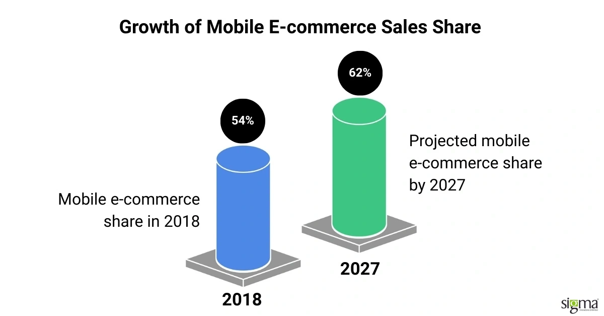
A large part of eCommerce growth worldwide stems from consumers buying products and services via mobile devices. According to Statista’s Insights, mobile e-commerce sales are poised to reach a value of $ 3.4 trillion by 2027, comprising over half of all retail e-commerce sales. This share has grown steadily, from 54% in 2018 to an expected 62% by 2027.
Although mobile traffic dominates retail visits and order volumes globally (80% of visits and 66% of orders), desktops still lead when it comes to average order value (AOV). In 2024, October saw the peak AOV via desktops at $204. By contrast, mobile and tablet AOVs consistently trailed behind. These stats highlight the importance of optimizing both engagement and conversions on mobile.
The Mobile Device Takeover
Smartphones and tablets have become primary tools for browsing and shopping online. Around 34% of global online shoppers use mobile commerce weekly. This shift isn’t just convenience-driven—mobile devices dominate web traffic and generate two-thirds of e-commerce orders.
However, this increasing reliance on mobile demands robust, responsive design to ensure seamless user experience across screen sizes.
M-Commerce Tough Spots
While mobile traffic continues to rise, conversion rates still lag behind those on desktop and tablet. Despite high add-to-cart activity, several challenges continue to hinder mobile purchases:
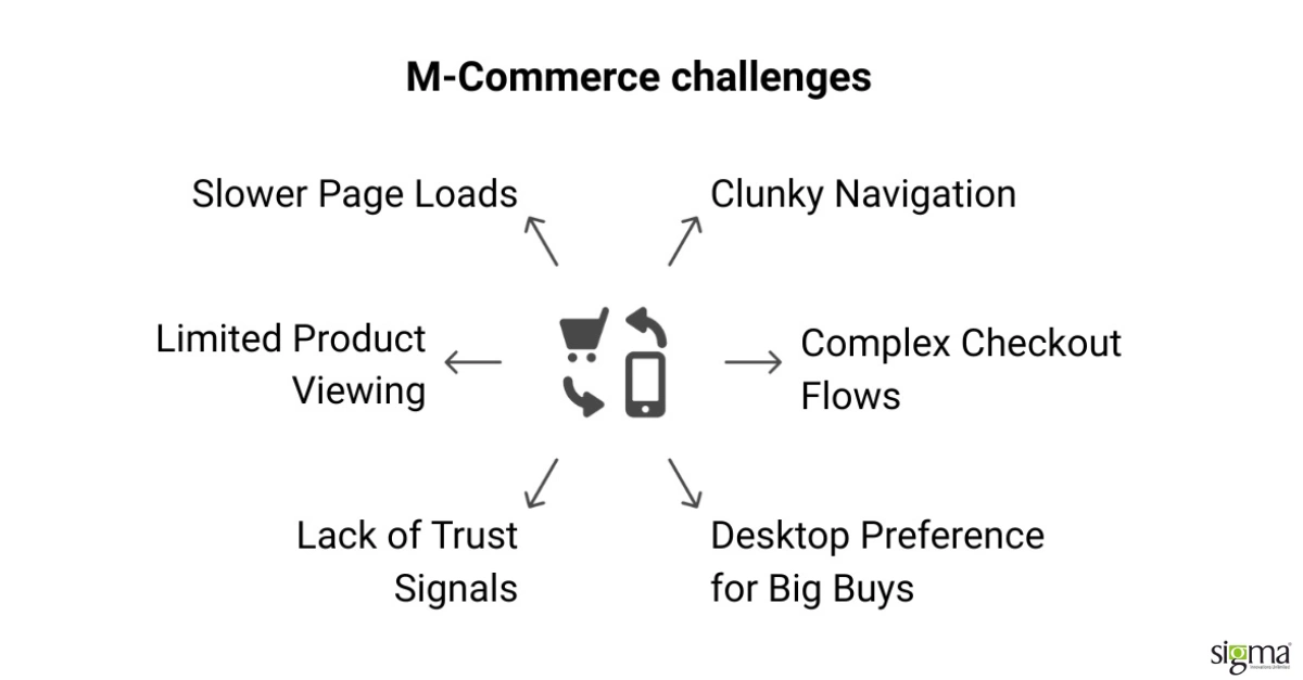
- Slower Page Loads: Mobile users are quick to abandon sites that take more than 3 seconds to load.
- Clunky Navigation: Menus and buttons not optimized for touchscreens make browsing frustrating.
- Complex Checkout Flows: Multi-step or non-intuitive checkouts lead to cart abandonment.
- Lack of Trust Signals: Users often hesitate to complete high-value purchases on mobile due to trust or security concerns.
- Limited Product Viewing: Small screens restrict image clarity and full product information visibility.
- Desktop Preference for Big Buys: For expensive items, shoppers still prefer the control and visibility offered by desktops.
How to Develop Mobile-First WooCommerce Pages with Plugins (and Test Them Effectively)
Building a mobile-first WooCommerce store goes beyond choosing a responsive theme. It requires using the right plugins, setting them up correctly, and testing on real devices to ensure a seamless shopping experience.
To put mobile-first design into practice, here’s a structured 12-step checklist with recommended plugins, setup instructions, and testing methods.
| Step | Plugin/Tool | Setup & Testing | Description |
|---|---|---|---|
| 1.Select a mobile-optimized theme | Astra, GeneratePress, Storefront | Install the theme, configure responsive layouts, and test across devices. | Choosing a lightweight and responsive theme ensures fast loading and adaptability on all screen sizes. |
| 2.Optimize images for faster mobile loading | Smush, ShortPixel, Imagify | Install the plugin, enable automatic compression, and test image load speed. | Optimized images reduce page weight and improve Core Web Vitals for mobile users. |
| 3.Enable caching and performance optimization | WP Rocket, W3 Total Cache | Configure caching, enable GZIP, minify CSS/JS, and test with GTmetrix. | Caching reduces server load and speeds up mobile browsing. |
| 4.Implement lazy loading for media | a3 Lazy Load, Lazy Load by WP Rocket | Activate plugin, configure lazy load for images/videos, and test scroll loading. | With lazy loading, images only load when a visitor scrolls to them, cutting down the initial load time, improving initial mobile page speed. |
| 5.Use a mobile-friendly navigation menu | Max Mega Menu, Responsive Menu | Configure a mobile toggle menu and test usability on different screen sizes. | Simplifies navigation for smaller screens and improves accessibility. |
| 6.Add mobile-responsive forms | WPForms, Gravity Forms | Enable mobile-friendly fields, optimize input sizes, and test submission on mobile. | Responsive forms reduce friction for mobile users filling details. |
| 7.Optimize typography and readability | Easy Google Fonts, Elementor | Configure scalable fonts, proper line spacing, and test readability on small screens. | Readable fonts improve user experience and engagement on mobile. |
| 8.Test AMP (Accelerated Mobile Pages) | AMP for WP, Official AMP | Enable AMP, configure templates, and test page validation with Google AMP test. | AMP provides stripped-down versions of pages that load instantly on mobile. |
| 9.Optimize Your Store for Mobile SEO | Rank Math, Yoast SEO | Enable mobile meta tags, schema, and preview snippets on mobile. | SEO optimization helps improve mobile SERP rankings and CTR. |
| 10.Use mobile analytics and behavior tracking | Google Analytics 4, Hotjar | Connect GA4, enable Hotjar heatmaps and session recordings, and review data. | Tracks how mobile users interact with the site, highlighting issues in UX. |
| 11.Test mobile performance regularly | Google PageSpeed Insights, GTmetrix | Run tests on mobile mode, analyze Core Web Vitals, and optimize accordingly. | Regular monitoring ensures performance remains stable after updates. |
| 12.Conduct real device testing | BrowserStack, LambdaTest | Test across multiple devices and browsers, record issues, and fix. | Real-world testing validates mobile responsiveness and usability beyond emulators. |
Conclusion
In an era where mobile drives the majority of e-commerce interactions, designing with a mobile-first mindset is no longer optional. From selecting responsive themes and optimizing speed to leveraging plugins and testing across devices, every step plays a crucial role in boosting user satisfaction and conversion rates. A well-executed mobile-first WooCommerce store not only meets today’s expectations but also future-proofs your business for years to come.
Looking to build a customer-focused eCommerce store? Leverage Sigma’s WooCommerce Development Services for the best outcomes.


